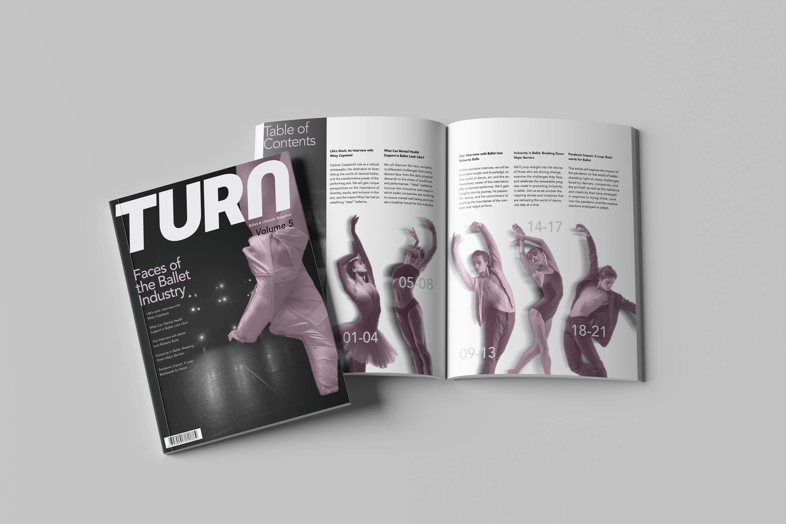
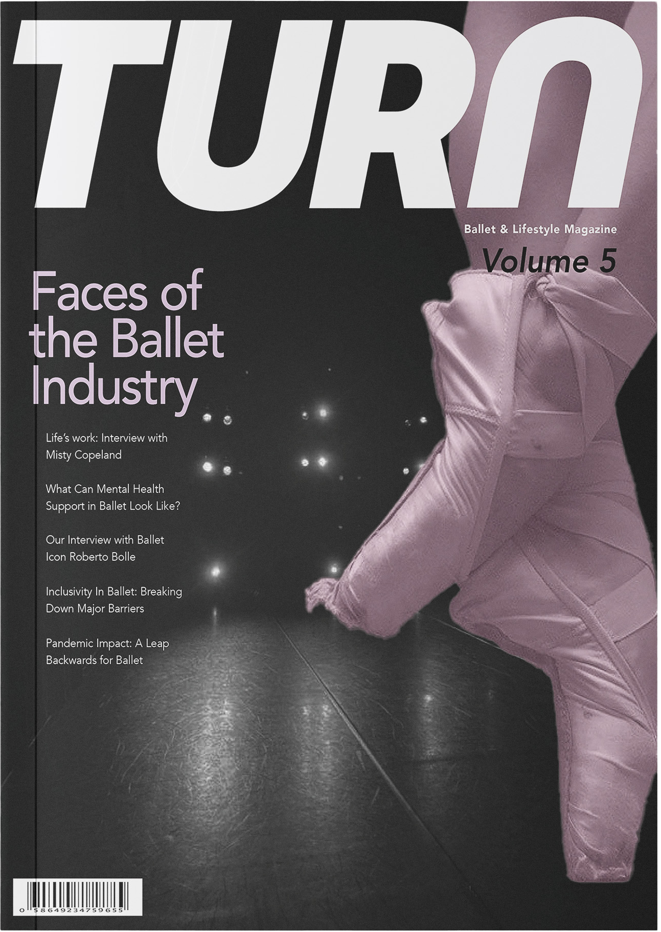
TURN PUBLICATION DESIGN
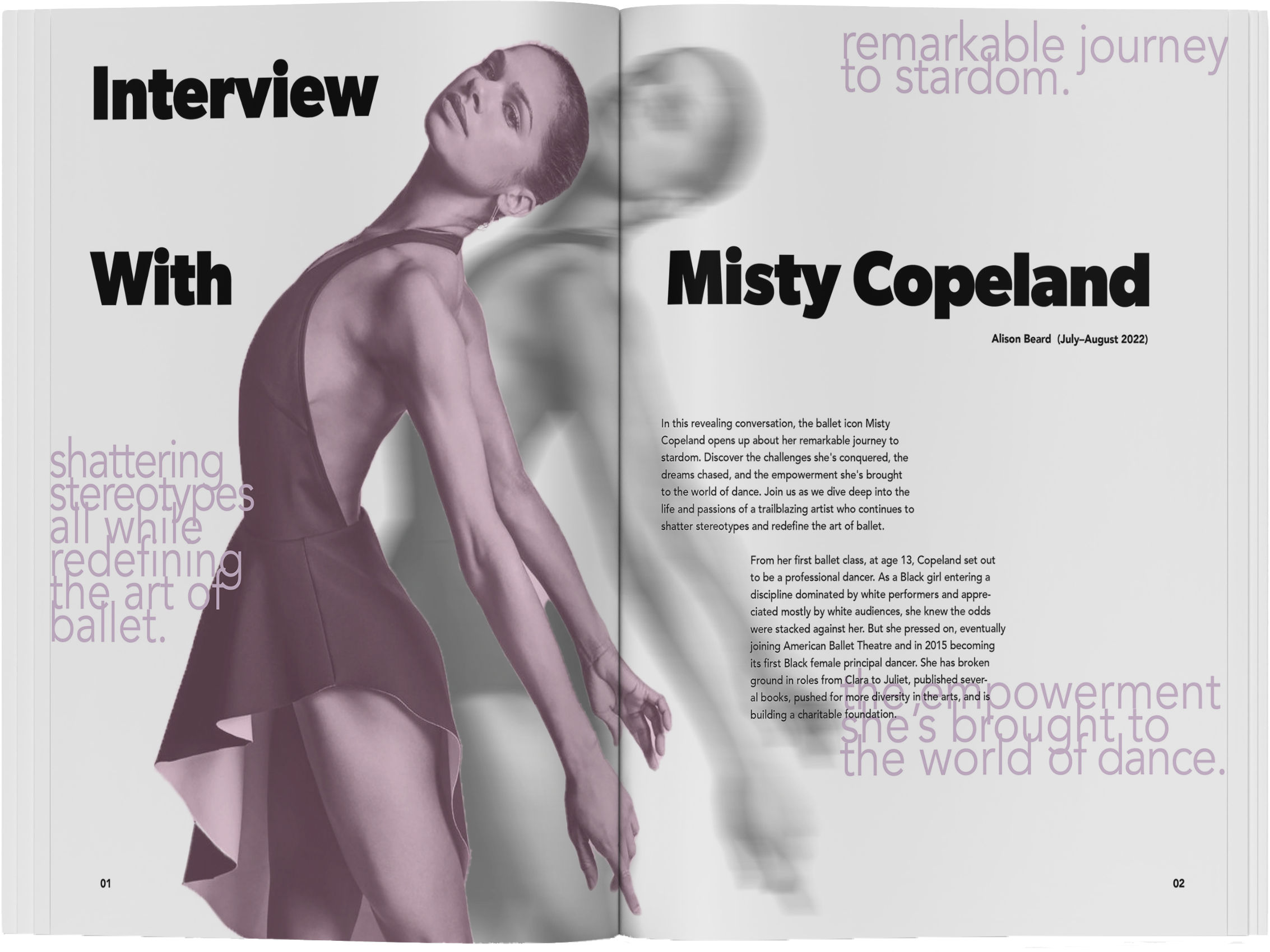
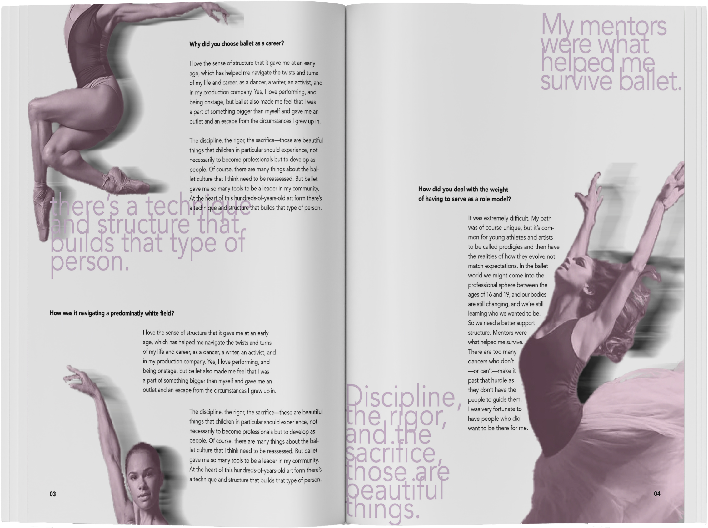
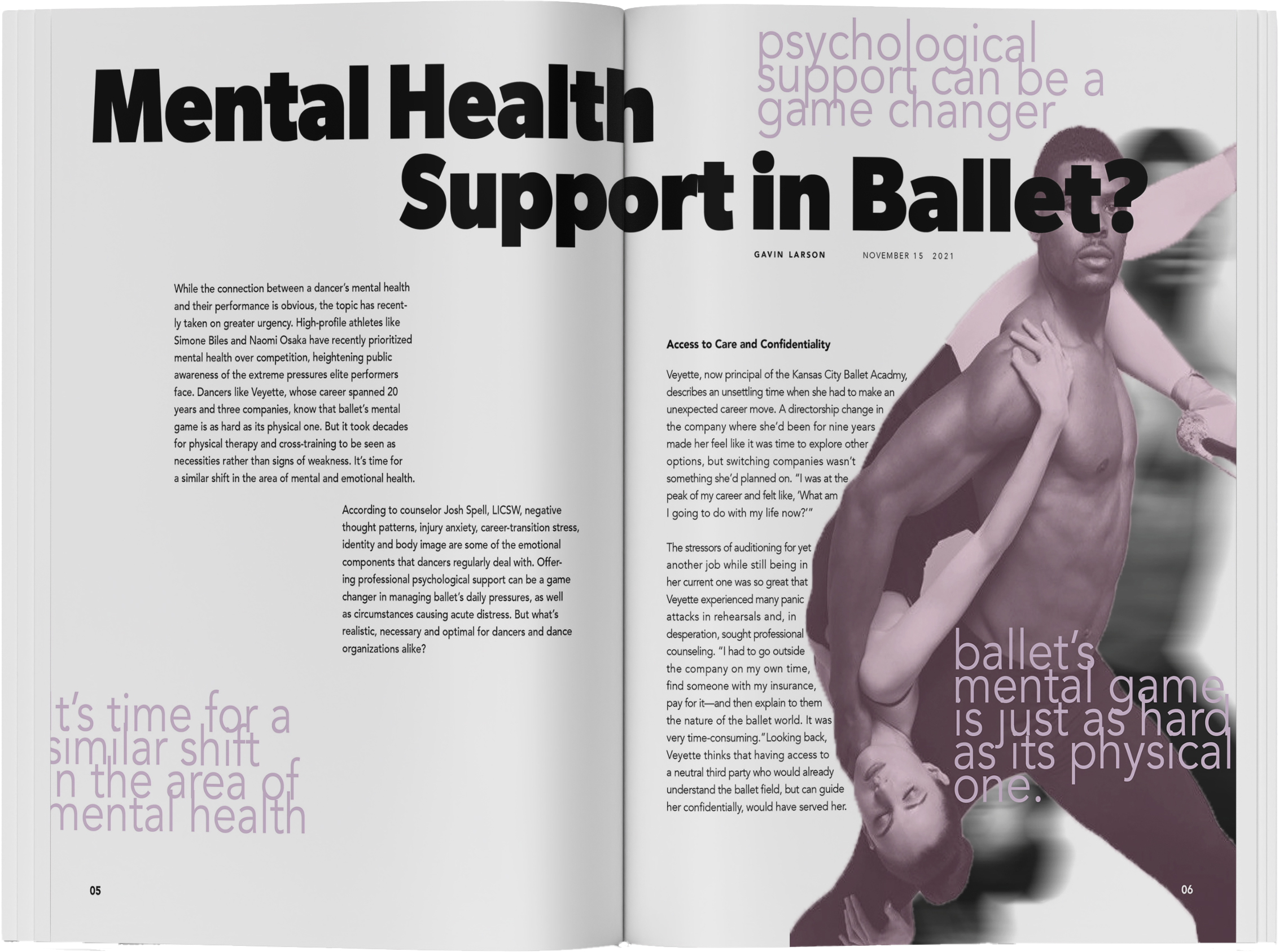
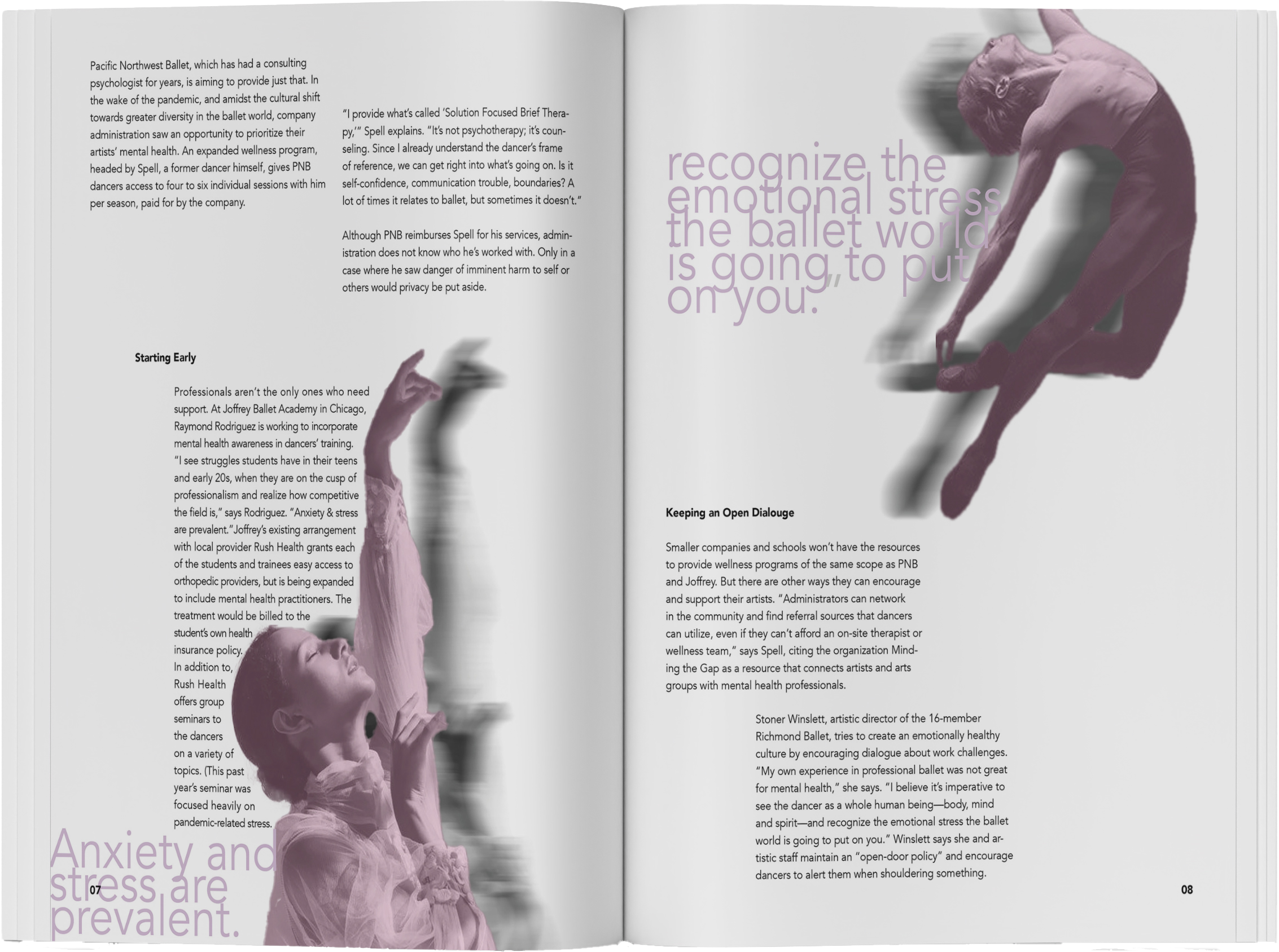
Turn is a sports and lifestyle publication that provides readers with insight into the lives, success stories, and struggles of the faces within the Ballet Industry. Objective was to utilize typographic knowledge in order to explore typography through identity development and to develop a wordmark that typographically communicates the meaning behind the publication.
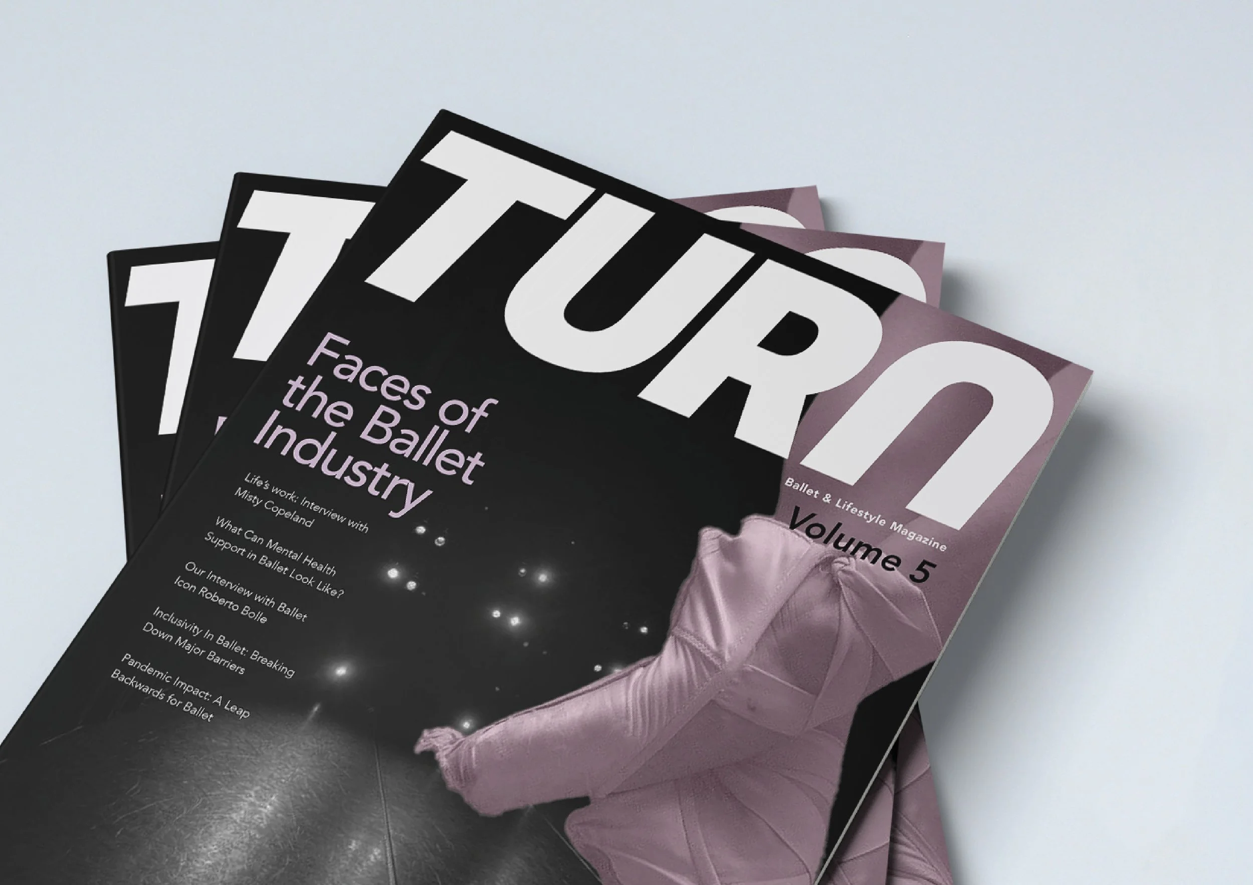
WORDMARK
Emphasizes the contrast between sharp and rounded letterforms to echo the varied movements found in ballet, while maintaining minimal weight contrast to reflect the discipline and structured nature of the practice.

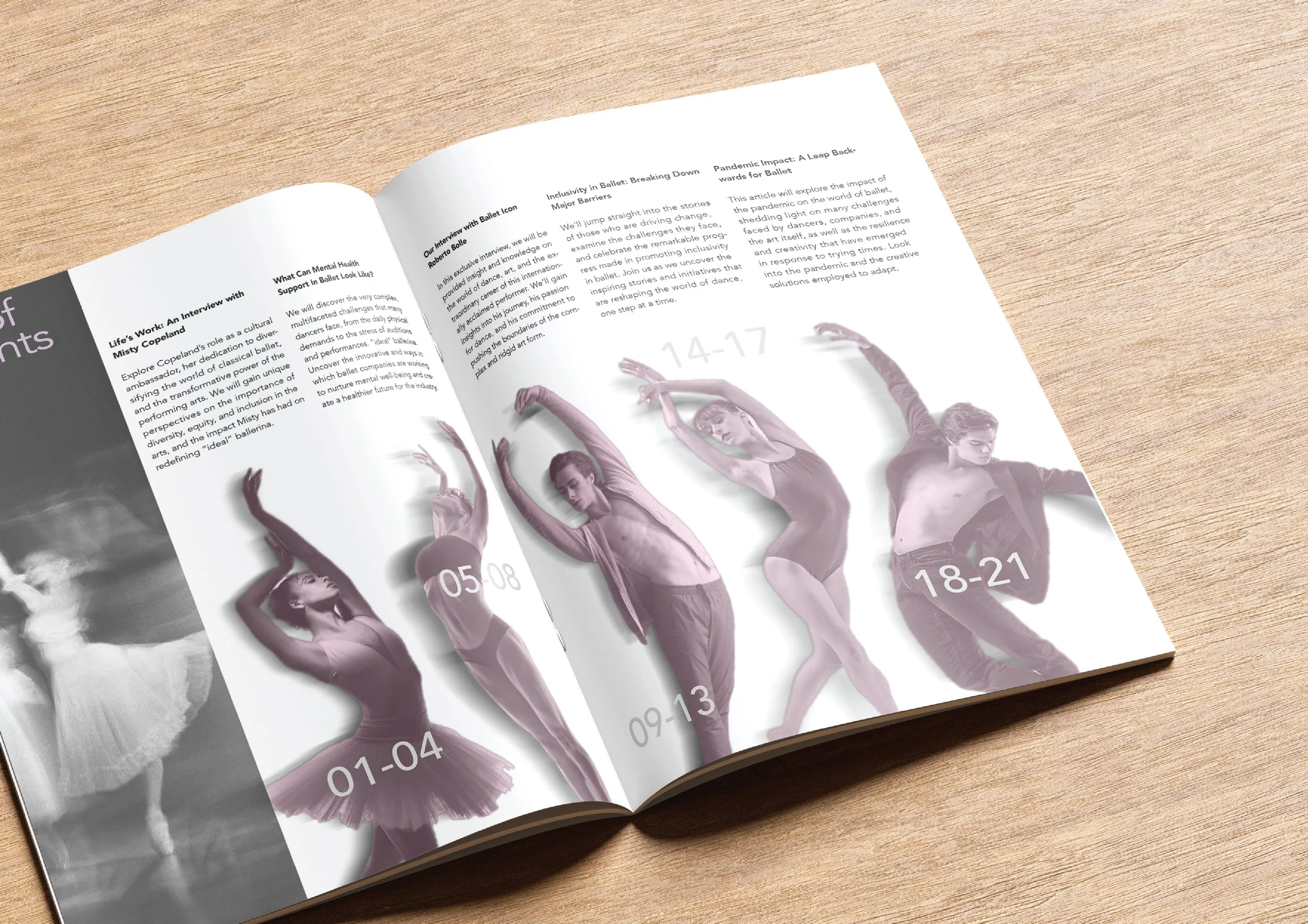
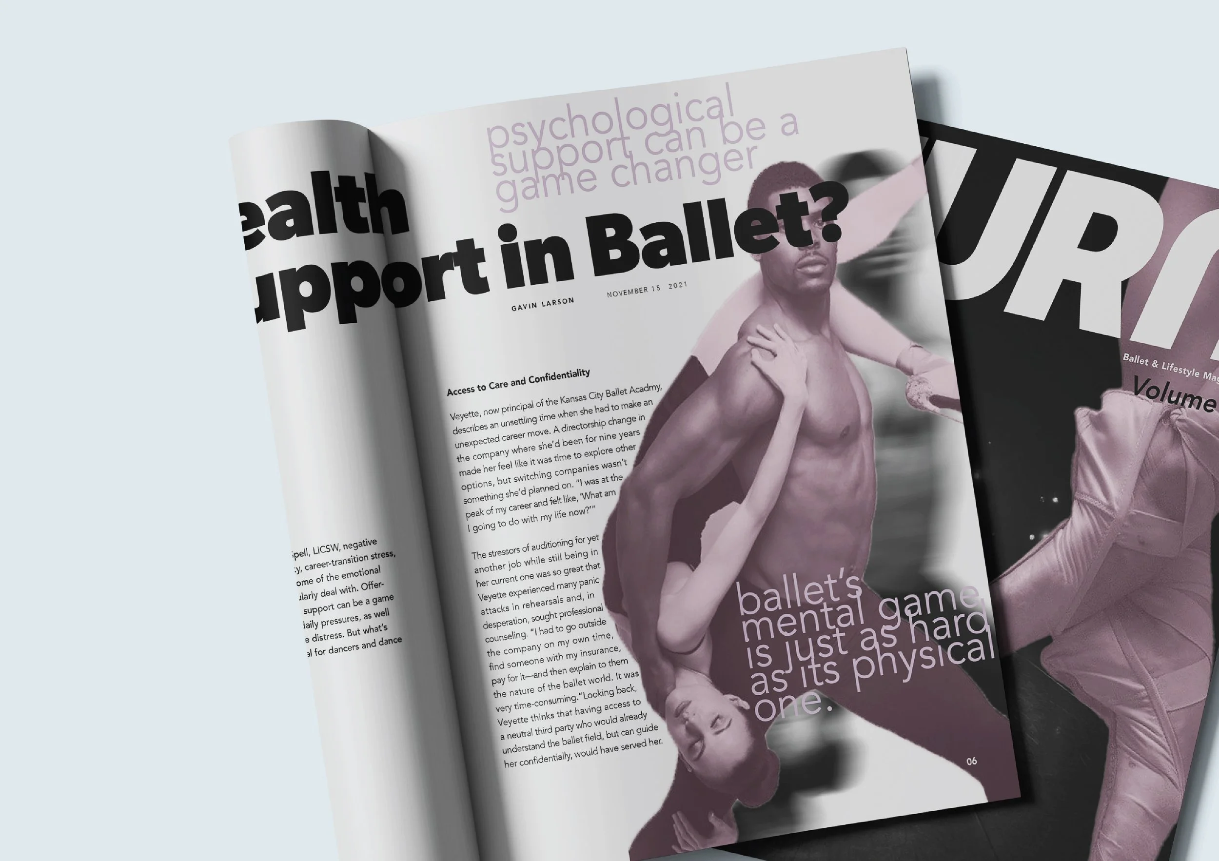
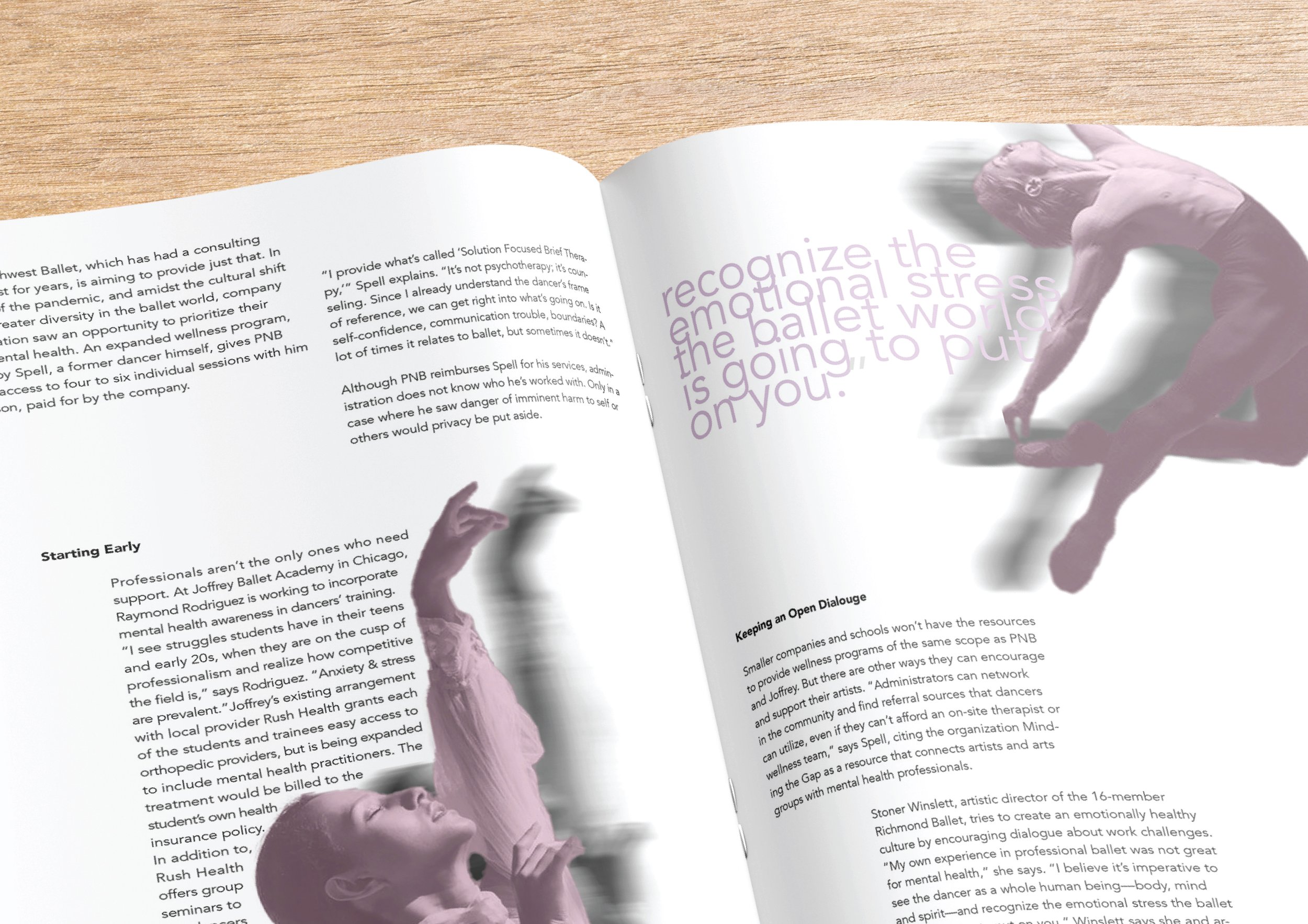
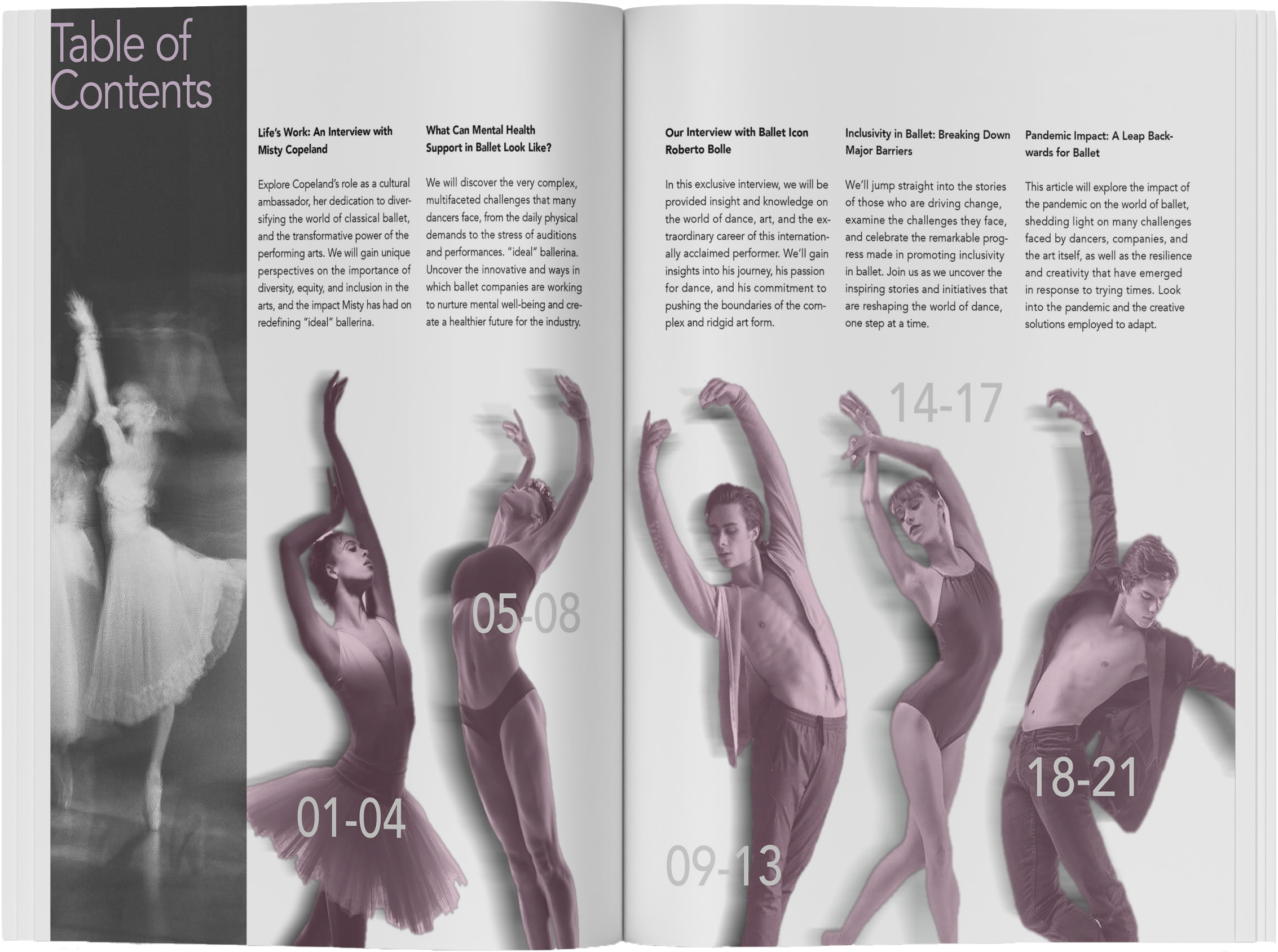
SPREADS
VISUAL SYSTEM